Blog | Tutorials | Watercolor
Paint a Winter Wonderland in Watercolor
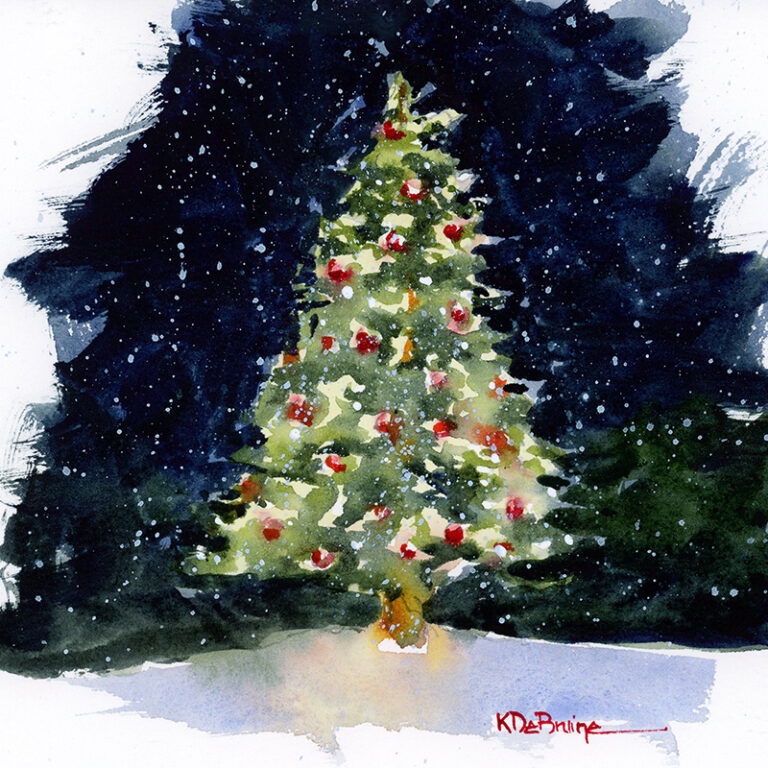
Paint a Winter Wonderland in Watercolor In celebration of the winter holidays, I’ve created a full-length tutorial on my YouTube channel, showing you how to paint a snowy winter scene in watercolor.