Build Watercolor Skills with Quick Tip Videos
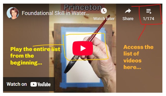
Quick Tip Videos from the Studio This YouTube playlist contains hundreds of short videos from Kris DeBruine Studio that are 60 seconds to 3 minutes long. They deliver helpful watercolor tips and essential skills for the growing artist. Watch them all or pick and choose from the playlist. Quick Tip Videos from the Studio This…